목차
2021.12.25 - [통계학] - 잔차(residual)를 이용한 Bootstrapping
잔차(residual)를 이용한 Bootstrapping
선형회귀모형에서 제일 많이 사용되는 bootstrap은 paired bootsrap이다. 이는 data table이 있다면 row를 resampling하는 방식이다. 즉, $(X_i, Y_i)$를 pair로 resampling하는 것이다. 이 방식은 단순하기 때문..
sanghn.tistory.com
위의 포스트에 이어서 이번엔 bootstrap을 이용해 가설검정을 해보자.
1. Bootstrap 신뢰 구간
지난 포스트와 마찬가지로, Least Absolute deviation (LAD) 추정량을 예시로 R코드를 만들었다. 모델은 다음과 같다.
$$Y_i = 3 + 2X_i + \epsilon_i$$
여기서 오차항 $\epsilon_i $ 는 95% 확률로 표준정규분포를 따르고, 5%의 확률로 표준편차가 8인 정규분포를 따른도록 한다.
표본의 크기 $n$은 31로 설정했다. 이 포스트에서는 $X$의 계수인 $\beta_{1}=2$에 대한 신뢰구간을 구하고자 한다.
dgp_x <- function(n=31){
  x = sample(0:15, size = n, replace = TRUE)
  return(x)
}

dgp_yx <- function(x, k=8, a=3, b=2){
  n <- length(x)
  e <- rnorm(n, 0, (1 + (k - 1)*rbinom(n, 1, 0.05)))  ## error
  y <- a+ b*x + e
  return(cbind(y,x))
}
이제 LAD 추정량 함수와 잔차 (residual)로 bootstrap sample을 만들어내는 함수를 정의한다.
lad <- function(data){
  est.lad <- nlminb(coef(lm(data[,1]~data[,2])),
                    function(x){sum(abs(data[,1] - (x[1] + x[2]*data[,2])))})
  return(est.lad$par)
}

lad.bt <- function(data, R=5000){
  est = lad(data) # get estimation of a and b
  fit.y = est[1] + est[2]*data[,2]
  e = data[,1] - fit.y
  e = e - mean(e)
  bt.star <- function(data, e, est){
    e = sample(e, replace = TRUE)
    y.star = est[1]+ est[2]*data[,2] + e
    return(lad(cbind(y.star, data[,2])))

  }
  output = replicate(R, bt.star(data, e, est))
  return(output)
}
이제 bootstrap을 통해 신뢰구간을 구해보자.
Bootstrap으로 신뢰구간을 구하는 방법은 여러가지가 있는데 이 포스트에서는 가장 대표적인 3가지 신뢰구간을 사용하고자 한다.
(1) Normal approximation (정규분포 근사)
첫번째는 가장 우리에게 익숙한 정규 분포로 근사하여 추정한 신뢰구간이다.
$$\left( \hat{\theta} - z_{1-\alpha/2} \cdot \hat{se(\theta)}, \hat{\theta} + z_{1-\alpha/2} \cdot \hat{se(\theta)}\right)$$
여기서 $\hat{\theta}$는 추정량이고, $ z_{1-\alpha/2} $는 표준정규분포의 $ 1-\alpha/2 $ percentile, $ \hat{se(\theta)}$은 추정량의 standard error이다.
ci.normal <- function(x, statistic, alpha=0.05, R=5000){
  bt.output <- lad.bt(x, R)
  sample.est <- statistic(x)
  #lb = lower bound, ub = upper bound
  #CI for normal approximation,
  lb <- sample.est[2] - qnorm(1 - alpha/2) * sd(bt.output[2])
  ub <- sample.est[2] + qnorm(1 - alpha/2) * sd(bt.output[2])

  return(c(lb, ub))

}
(2) Reverse percentile interval
두번째는 $\hat{\theta} - \theta$의 분포를 사용하여 신뢰구간을 추정하는 방법으로, 다음과 같다.
$$ \left( 2\hat{\theta} - \theta^{*}_{1-\alpha/2}, 2\hat{\theta} + \theta^{*}_{\alpha/2} \right) $$
$ \theta^{*}_{1-\alpha/2} $는 bootstrap sample 추정량의 $ 1-\alpha/2 $ percentile이다.
Reverse percentile interval은 original 추정량 - 실제값 ($ \hat{\theta} - \theta$)이 bootstrap 추정량 - original 추정량 ( $\theta^{*} - \hat{\theta}$)의 분포와 비슷하다는 .bootstrap의 원리를 따르고 있기 때문에 수학적으로 잘 정의된다.
ci.basic <- function(x, statistic, alpha=0.05, R=5000){
  bt.output <- lad.bt(x, R)
  sample.est <- statistic(x)
  #lb = lower bound, ub = upper bound
  #basic bootstrap CI
  lb <- sample.est[2] - quantile(bt.output[2,] - sample.est[2],
                                 1 - alpha/2, names=FALSE)

  ub <- sample.est[2] - quantile(bt.output[2,] - sample.est[2],
                                 alpha/2, names=FALSE)

  return(c(lb, ub))

}
(3) Percentile interval
마지막은 percentile interval로 (2)의 reverse percentile interval과 비슷하지만, bootstrap 추정량 $\theta^{*}$의 분포 자체를 사용한다는 점에서 차이가 있다.
$$ \left( \theta^{*}_{\alpha/2}, \theta^{*}_{1-\alpha/2} \right) $$
ci.percentile <- function(x, statistic, alpha=0.05, R=5000){
  bt.output <- lad.bt(x, R)
  sample.est <- statistic(x)
  #lb = lower bound, ub = upper bound
  #percentil CI
  lb <- quantile(bt.output[2,], alpha/2, names=FALSE)
  ub <- quantile(bt.output[2,], 1 - alpha/2, names=FALSE)

  return(c(lb, ub))
}
(4) 각 신뢰구간 결과
위의 코드들을 사용하여, 데이터를 생성하고 $\beta_{1}=2$에 대한 95% 신뢰 구간을 구하면 다음과 같다.
normal approximation: (1.995745 2.159024 )
reverse percentile: (1.996622 2.163229 )
percentile: (1.991397 2.155729 )
percentile 이 가장 왼쪽으로 치우쳐져있고, reverse percentile이 가장 오른쪽으로 치우쳐져 있음을 관찰할 수 있다.
이제 시뮬레이션을 통해 시각화를 해보자. 아래는 3가지 신뢰구간의 bias를 계산하는 함수이다. Bias는 신뢰구간의 중앙값에서 실제 값을 뺀 값이다.
test.ci.bias <- function(x, statistic, theta0, alpha = 0.05, R=50000){
  bt.output <- lad.bt(x, R)
  sample.est <- statistic(x)
  #lb = lower bound, ub = upper bound
  #CI for normal approximation,
  lb1 <- sample.est[2] - qnorm(1 - alpha/2) * sd(bt.output[2,])
  ub1 <- sample.est[2] + qnorm(1 - alpha/2) * sd(bt.output[2,])
  result1 <- (ub1 + lb1)/2 - theta0

  #CI based on reverse percentile method
  lb2 <- sample.est[2] - quantile(bt.output[2,] - sample.est[2],
                                 1 - alpha/2, names=FALSE)

  ub2 <- sample.est[2] - quantile(bt.output[2,] - sample.est[2],
                                 alpha/2, names=FALSE)
  result2 <- (ub2 + lb2)/2 - theta0

  #CI pretending the dist of statistic*(x*) = dist of statistic(x)
  lb3 <- quantile(bt.output[2,], alpha/2, names=FALSE)
  ub3 <- quantile(bt.output[2,], 1 - alpha/2, names=FALSE)
  result3 <- (ub3 + lb3)/2 - theta0

  #combining the three results
  final_result <- c(result1, result2, result3)

  return(final_result)
}
이제 아래의 코드로 샘플의 수가 15와 31인 경우의 시뮬레이션을 하였다. 시뮬레이션 횟수는 1000번이다.
ibrary(parallel)
cl <- makeCluster(detectCores())
clusterExport(cl, "lad")
clusterExport(cl, "lad.bt")
clusterExport(cl, "test.ci.bias")
clusterExport(cl, "dgp_x")
clusterExport(cl, "dgp_yx")
clusterSetRNGStream(cl, 6262)

par_result.ci.15 <- parApply(cl, replicate(1000, dgp_yx(dgp_x(n=15))), 3,
                              test.ci.bias,
                              statistic = lad,
                              theta0 = 2,
                              R=15)

par_result.ci.31 <- parApply(cl, replicate(1000, dgp_yx(dgp_x(n=31))), 3,
                              test.ci.bias,
                              statistic = lad,
                              theta0 = 2,
                               R=31)
stopCluster(cl)

bt.bias <- rbind(rowMeans(par_result.ci.15), rowMeans(par_result.ci.31))
rownames(bt.bias) <- c("n=15", "n=31")
colnames(bt.bias) <- c("normal", "reverse_percentile", "percentile")

print(as.data.frame(bt.bias))
아래는 1000번의 시뮬레이션을 통해 얻은 각 신뢰구간의 bias의 평균이다. Reverse percentile이 가장 bias가 작고, percentile이 bias가 가장 크다.
| normal | reverse_percentile | percentile | |
| n=15 | 0.002975033 | 0.002753436 | 0.003196629 |
| n=31 | 0.001827847 | 0.001213100 | 0.002442595 |
마지막으로, 시뮬레이션을 통해 얻은 bias의 분포를 그려보자.
library(ggplot2)
library(grid)
library(gridExtra)

par_result.ci.15 <- as.data.frame(t(par_result.ci.15))
colnames(par_result.ci.15) <- c("normal", "reverse_percentile", "percentile")
par_result.ci.31 <- as.data.frame(t(par_result.ci.31))
colnames(par_result.ci.31) <- c("normal", "reverse_percentile", "percentile")

ggplot() + geom_density(aes(x=par_result.ci.15$normal, colour="normal")) +
  geom_density(aes(x=par_result.ci.15$reverse_percentile, colour="reverse_percentile")) +
  geom_density(aes(x=par_result.ci.15$percentile, colour="percentile")) +
  xlab("bias") + ylab("Density") + ggtitle('bias coverage sample=15') +
  theme(legend.position = 'right') +
  scale_color_manual(values = c('normal' = 'red',
                                'reverse_percentile' = 'blue',
                                'percentile' = 'green'))
ggplot() + geom_density(aes(x=par_result.ci.31$normal, colour="normal")) +
geom_density(aes(x=par_result.ci.31$reverse_percentile, colour="reverse_percentile")) +
geom_density(aes(x=par_result.ci.31$percentile, colour="percentile")) +
xlab("bias") + ylab("Density") + ggtitle('bias coverage sample=15') +
theme(legend.position = 'right') +
scale_color_manual(values = c('normal' = 'red',
'reverse_percentile' = 'blue',
'percentile' = 'green'))

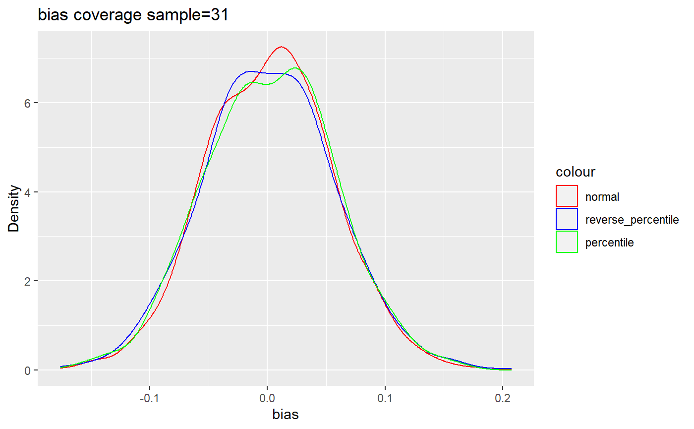
역시 분포의 중심이 가장 0에 가까운 것은 reverse percentile interval의 경우인 것을 관찰할 수 있다.
'데이터 사이언스' 카테고리의 다른 글
| 네트워크 데이터 분석 - Centrality (0) | 2024.06.29 |
|---|---|
| 네트워크 데이터 분석 - 현실 네트워크의 특징들 (0) | 2024.06.26 |
| 네트워크 데이터 분석 - Networkx (0) | 2024.06.24 |
| 네트워크 데이터 분석 - 서론 (0) | 2024.06.20 |
| 잔차(residual)를 이용한 Bootstrapping (0) | 2021.12.25 |